David's Ideation & Prototyping Blog

My Project for the semester

The project I have decided to undertake is my blog page. It's super meta. I come from a web and cs development background and I've wanted for a while to learn how create a parallax scrolling website. My goal is to work daily/weekly to turn this simple page into a parallax scroller with some fun custom made images. If I can get to it I'd love to make the images on the sides of the blog more interactive and potentially resemble something like a Rube Goldberg as someone scrolls through the site.

I am hoping to improve my coding ability on the one hand, and work on more creative/design by making the website look glossy and by drawing the images for the side margins of the page. This kind of thing alfredservice.com

Everything is a Remix Response

After watching Everything is a Remix, it is easy to think of almost any technological or artistic endeavor as a combination of previous developments and ideas. In this light it is interesting to consider the influences of a work close to as important as the work itself. For example, I was surprised by the amount of shots and even whole scenes reused in Hollywood as directors drew from famous films across decades.
Remix mentions that the first step of any great artist or thinker is to experience something, and then try to transform it into something superior. It also mentions that often multiple people are reaching the same developments at the same time. Calculus, as is mentioned in the film was developed at the same time in Britain and Saxony (Germany) in the 17th century. It is easy in our modern, connected world to understand how people could be influenced by the same things, but I wonder what it was that pushed Newton and Leibniz to this discovery and how much of the influencing material was the same.
 It is believed that Leibniz may have seen some of Newton's writings, helping him to develop his theory further. Leibniz ultimately published his findings first and much of the notation we use today was developed by him. This brings up the question of plagiarism and how to approach the sharing of ideas. As a result of the argument over who created Calculus there was an over 100 year disagreement within the scientific community. How can we avoid this and other strife over how much is "copied" or taken from other's ideas? Additionally where is the fine line between the transformation of an idea into a new iteration of it, and plagiarism drawn?
 One solution to this problem could come from citation. By citing influences and explaining how an idea came to be, we could learn much about the ideation process. Trends in creation could be found by understanding how people took previous developments and transformed and combined them to create a new idea. This could also serve to protect those who are faced with development costs by ensuring that knockoffs cannot legally exist. If each idea documented its influences, then we could understand how major ideas often come about at the same time, and avoid attrition for those who take the risk of developing something new.

Curiosity Mood Board

I chose curiosity as my theme. One of the strongest moments of excitement and curiosity that I feel comes when an idea hits me, or I hear of an idea that I feel is innovative and different.
 It happens like this: I'm walking somewhere and talking to a friend when we hit on something fun, new, interesting, and immediately we start going back and forth about what this idea can become. There's an entire world of possibilities laid out in front of me. No matter how small the implications of an idea are, the mere fact that something that didn't exist a moment ago, has come into being and can now be expanded upon gives me an adrenaline rush. The next few moments are invariably filled with discussing the implications and directions the idea could take. The big question is, what could this idea transform into?
 As an idea adrenaline junky, I try to read as much as I can and speak to interesting people to discover more. Curiosity at the implications of an idea drives me to be curious in pursuing new ideas and learning more about the things around me. After I come up with an idea, I like to add it to my ideas list. From the list an idea can grow into a full business, be a fun side project, wait for a later time for when other ideas I've discovered and learned about can combine with it to make an ever better idea, or just exist on the page. What's most exciting about an idea is that it is what you make it and the more ideas you encounter, the more you want to encounter. This is why my mood board is about the curiosity that follows the discovery of an idea no matter its origin.

I/O Project Update

Since the last upload (here) I have spent about 90% of my time playing catchup with homeworks and quizzes. Because of this I have put in time to find and upload a library for parallax scrolling. I chose to use ScrollMagic.
  ScrollMagic comes with both a wide range of tools and large amount of examples of different ways to use parallax. Over the next week I hope to be able to implement some basic examples on my site to start working towards the Rube Goldberg functionality. In addition, I'm aiming to start some simple drawings that will make up the images on the site. -9/28/17

A New Direction

Tests, bad professors, holidays, and lack of sleep have all come together to bring about a pivot in my creative I/O project. At first I was planning on making a fun parallax site, I am transitioning to a new undertaking in design...

100 weeks of design

I am planning on creating, observing, and commenting on design. This will take many forms with short posts about different design articles, images, and software and hardware that I encounter. As part of this I have updated my blog site's design to make it simpler and easier to read.

When I practice design I aim to mix simple, clean design with straightforward, but sometimes unexpected functionality. Most of all, design should be intuitive.

Enjoy!

Simple Mobile Login Screens (1/2)

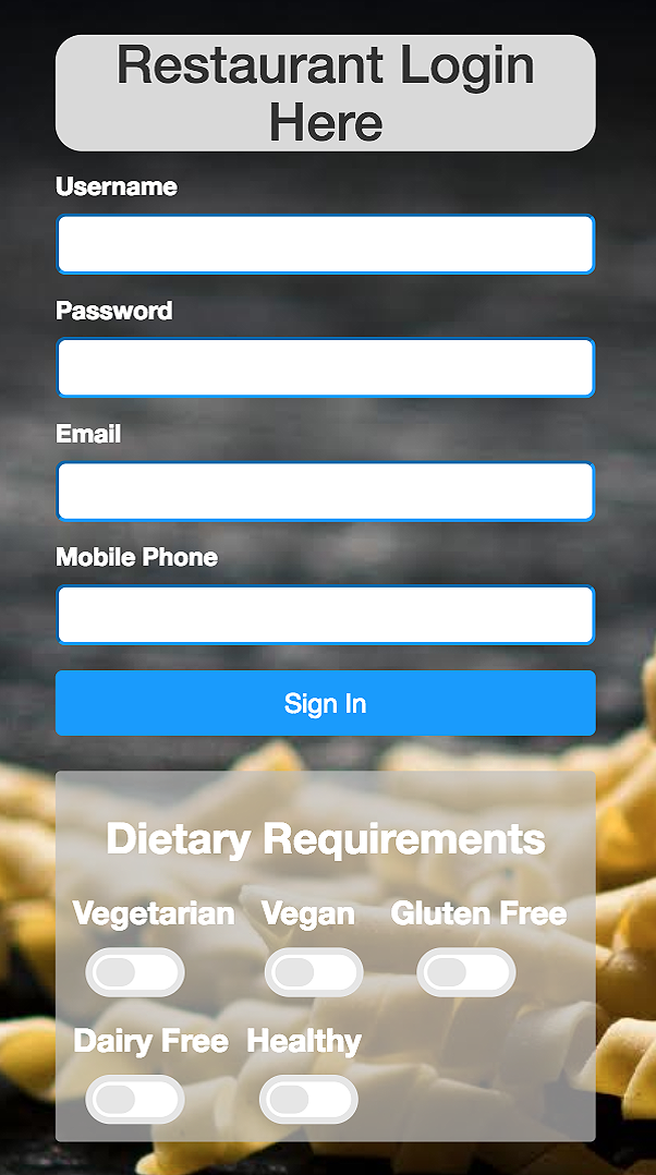
I created a login screen for a hackathon app this summer and decided to make similar login pages that could work for other purposes using the framework I created. The original screen created was for a culinary themed app, and I tried to introduce functionality and style accordingly.

From the original styleguide and page I made, I began looking for other themes and interests that may require a login screen. I began searching on unsplash.com and found a number of images that kept to simple themes and would work well in the background of a page, enhancing the experience but not overwhelming the text that the user must read. In the end I made a small number of examples and am hoping to be able to return to this project to design and create more example login pages, and post the code online for others to use in their own projects.

Food Service Login

The biggest challenges in creating this login screen were to ensure the text was legible throughout despite the background image, and to fit a lot of content onto a small screen without the screen being overwhelming. A translucent background area behind the toggles, and as much whitespace as possible helped solve these challenges in the project's current form.

Simple Mobile Login Screens (2/2)

Background images from: unsplash.com

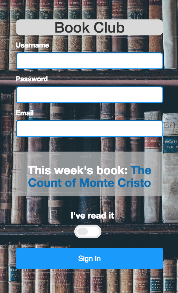
Reading Group Login

I created this login page in order to allow for a simple login page for a book group. The page includes some basic login form fields like username, password, and email, and a toggle. The toggle allows someone logging in to immediately indicate if they've read the most recent book being covered in the group. This can be used to turn on and off email reminders for the user, or to take votes on whether to pick a given book.

Each login page was created in html/css.

MOMA response: Becher Duo

The Becher Duo, Hilla and Bernd Becher matched photographs from across time and space in a simple, unadorned fashion to create collages with near identical elements. The Becher Duo mastered the typology in displaying the similarities between industrial structures that are eerily alike despite often being located on different continents. The Bechers began photographing together in 1959 and were married in 1961. They photographed together for over six decades and passed their knowledge on to others by teaching at their Alma mater, the Kunstakademie Düsseldorf, until 2007 when Bernd passed away.
  While studying the Bechers’ work, what I grew to appreciate most about the Becher's collages is the simplicity. Every photo is black and white and the backgrounds to each collage are white. It doesn’t matter what era the photos are taken in, from the early 1960’s to the early 2000’s, each industrial structure is shown in the same simple, unadorned way. What is most surprising, however, is the beauty and gravitas that the structures take on in the Bechers’ photographs. As Emma Hamilton notes in an American Photo article, “there are families of industrial forms, that utilitarian architecture can be appreciated for its aesthetics, and that these buildings can be re-framed and re-presented as sculptures.” The ability to take the ordain and monolithic and turn it into art, as if it is sculpture is what sets the Bechers apart.
  In addition to presenting their photographs with a very distinct style that turned the mundane to artistic and beautiful, the choice of subject for the Bechers is in itself interesting. Often what most catches the eye is that which is exceptional, but the Bechers dismissed this in favor of that which is often overlooked. To most, who do not work in industrial jobs, industrial equipment is simply a means to get some material or product into the hands of consumers. Industrial structures are large structures that invoke the people working there than an inherent character. When I think of an industrial factory, the first thing I think of is a worker in coveralls who stands dirty and sweaty after a hard day of work. The structures are impressive to most in scale, but do not take on the same meaning that they had to Bernd Becher. “Bernd Becher's fascination with industrial architecture was rooted in his childhood in the Ruhr, and he was acutely aware that the mega-structures throughout Germany, Europe and America would soon disappear from the landscape, just as the ones around his home had as Germany moved into a new, postwar economic era” notes Sean O’Hagan in a The Guardian article . Becher was seeking to preserve the industrial monoliths like those that surrounded him as he grew up, and it is perhaps this feeling that lent additional gravitas to the Becher Duo’s photographs.
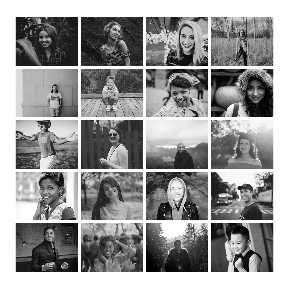
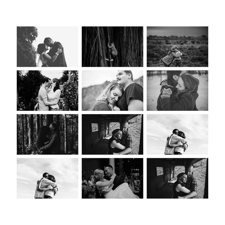
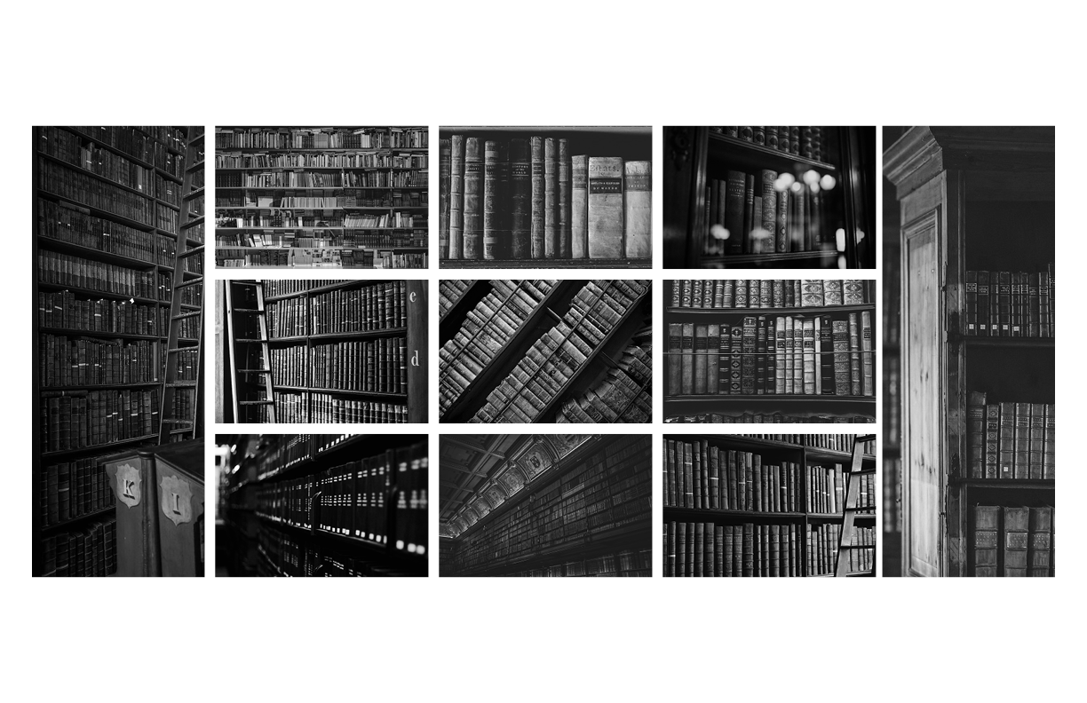
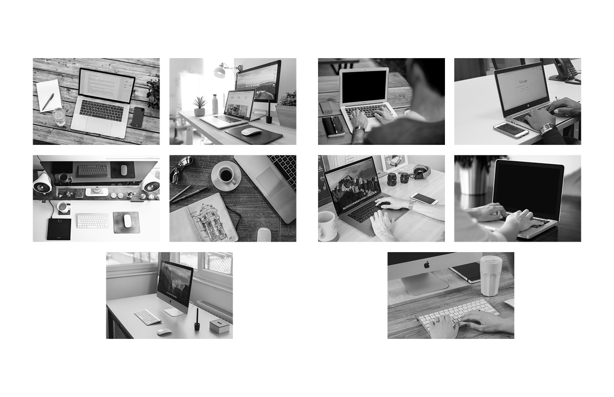
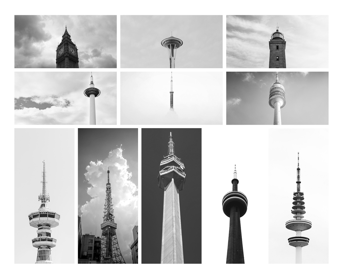
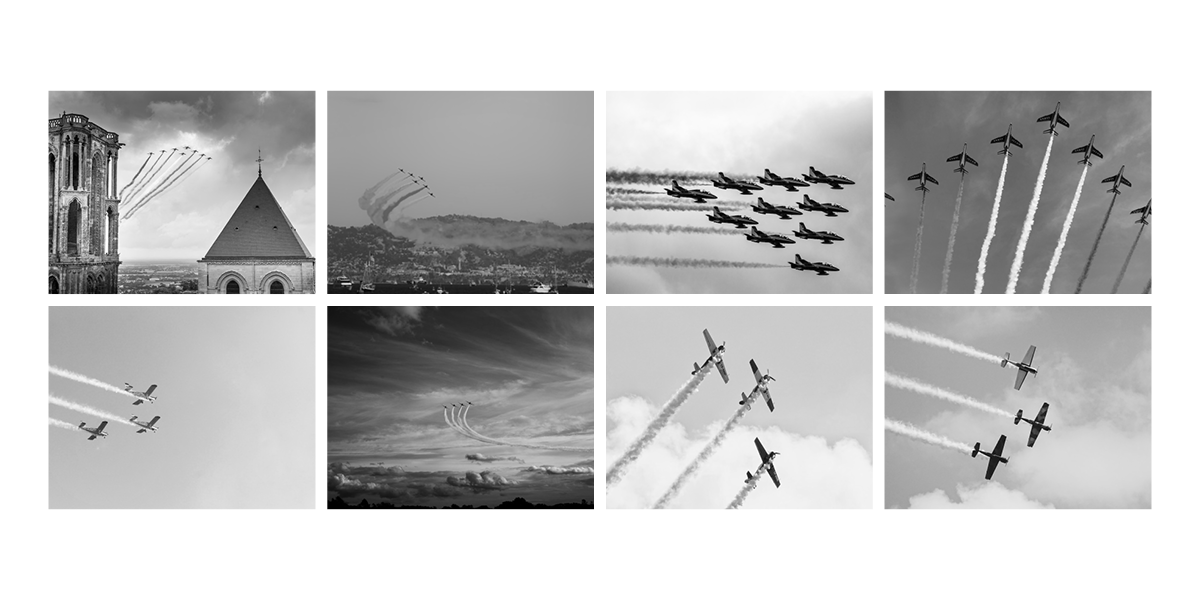
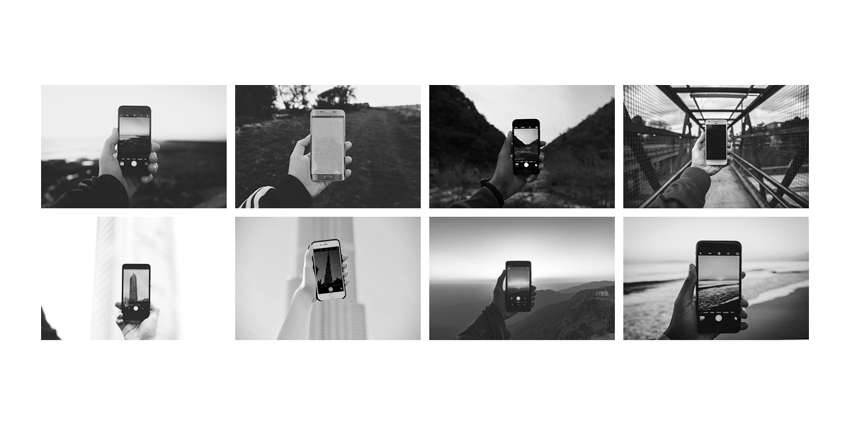
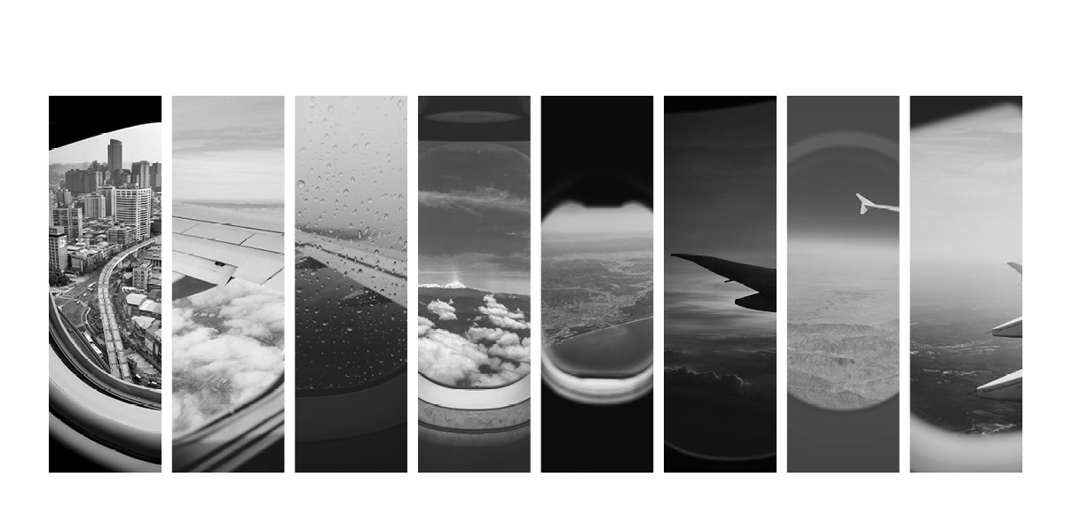
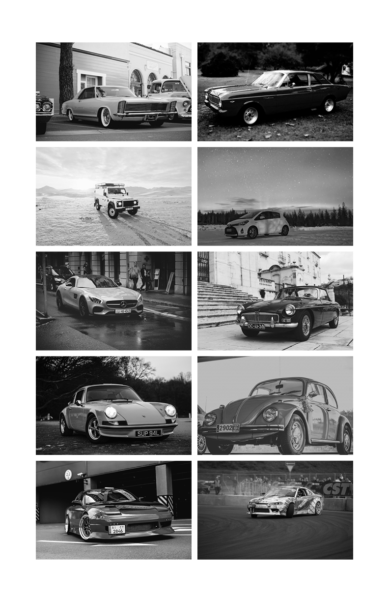
  Once I understood the method and motivation of the Becher Duo, I wanted to in some way capture their style. I decided to go on unsplash.com to see if the underlying ideas of simplicity and repetition could be replicated with pictures taken across the world and uploaded to the site. I was surprised to be able to make a number of very cohesive collages that touch on a number of subjects and showcase that, much like the Bechers found uniformity in industrial structures, each of us as humans has a shared perspective in capturing something. I chose a number of topics that range from a collection of towers that fit the Becher style to people smiling.
  To bridge the gap between the supremely industrial/architectural and the human I looked at how we interact with technology. Especially in the case of computers, I was fascinated to see how computers were photographed mainly as standalone accessories, much like a structure, and as being secondary to the hands using them. The messages could not be more different. One emphasizes the beauty of the machine and one of the human that uses it. The Bechers’ form of a singular subject, simple canvases, and black and white images are the guiding principles of my study of their typology, whether the subject is human or machine.

Becher Typology Studies

Smiles
Embrace
Books
Computers
Towers
Plane Formations With Trails
Cellphones
Plane Windows
Cars
Trains
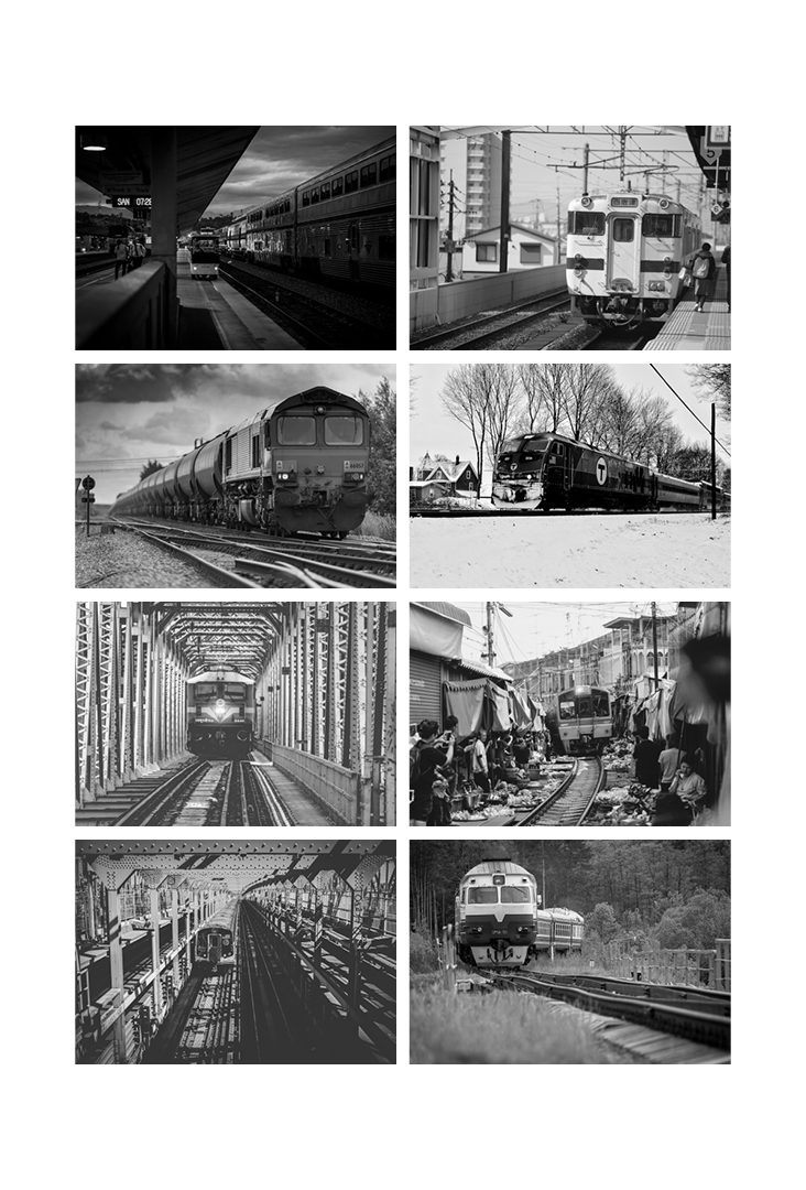
You can click on an image to download it
Simple Styleguide

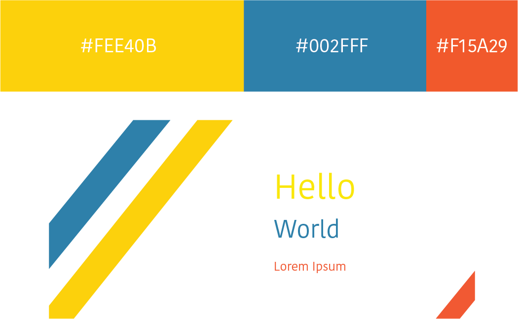
Styleguides are an easy way to prepare for a project by establishing a base aesthetic, and to present fonts and colors to clients. Every project should start with a styleguide that allows the visual aspects of the project to be established from the outset, guiding the emotion and feeling that surrounds anything from a website/app to physical product. I tried to incorporate proper whitespace into the styleguide to allow for each element to be viewed individually, but made the canvas small enough that each color and font can be viewed together.

Simple Styleguide 1

BoroughBike Design Project

BoroughBike is a new business concept geared towards encouraging exercise, improving the environment, and cutting down on traffic and congestion. Bicycling is a fast growing trend in cities, and has especially become more common as a means of commuting. Alongside this trend, traffic has only been increasing, especially in business centers like Midtown Manhattan. BoroughBike rewards users for leaving their car behind and using any bike to get to where they need to be.

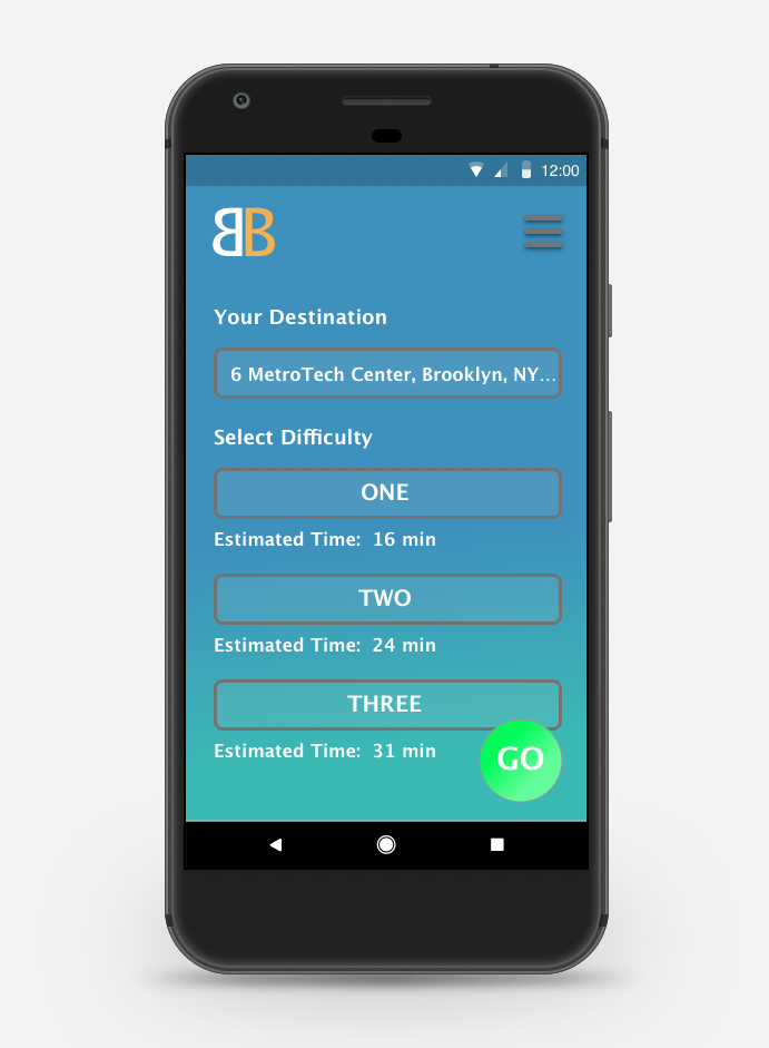
To earn rewards, users simply log in to BoroughBike and use it like a normal map for directions, with a twist. When the user enters a destination they are provided with 3 route options. The options increase in difficulty as each level is slightly more strenuous and longer than the previous. The difficulty of the route is measured based on distance and elevation. The more strenuous the route, the more points a user can earn. These points can be applied to a rewards system where users can win classes, experiences, discounts and swag from major lifestyle and fitness brands that BoroughBike has joined with. To understand more about BoroughBike and the motivations and trends behind it, you can view the pitch deck here.

Mood Board

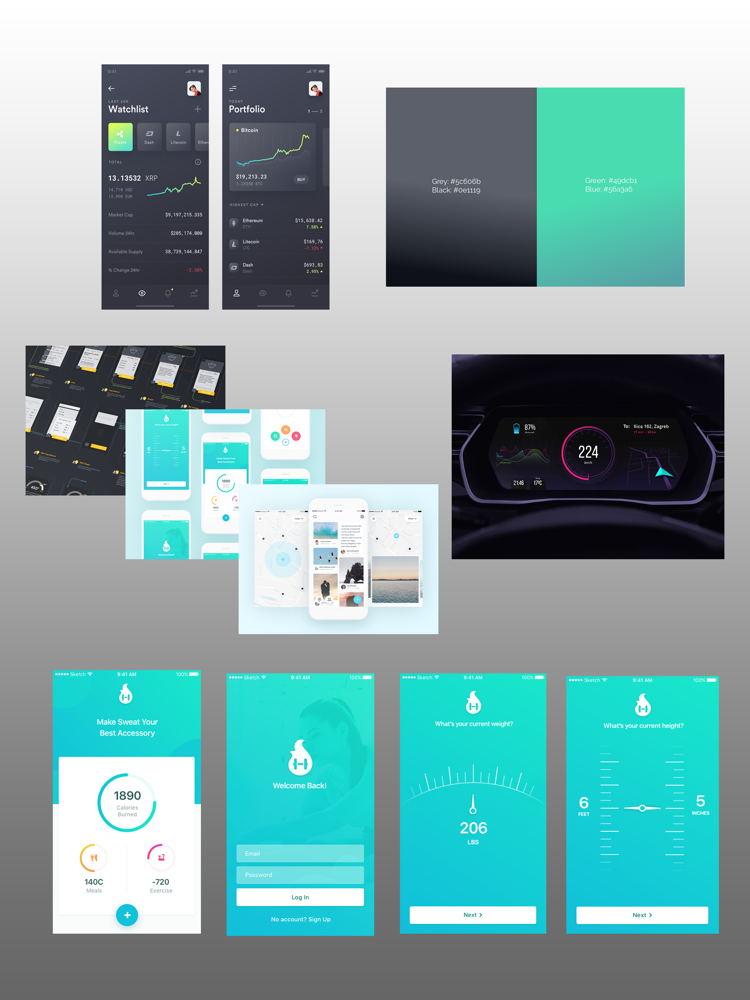
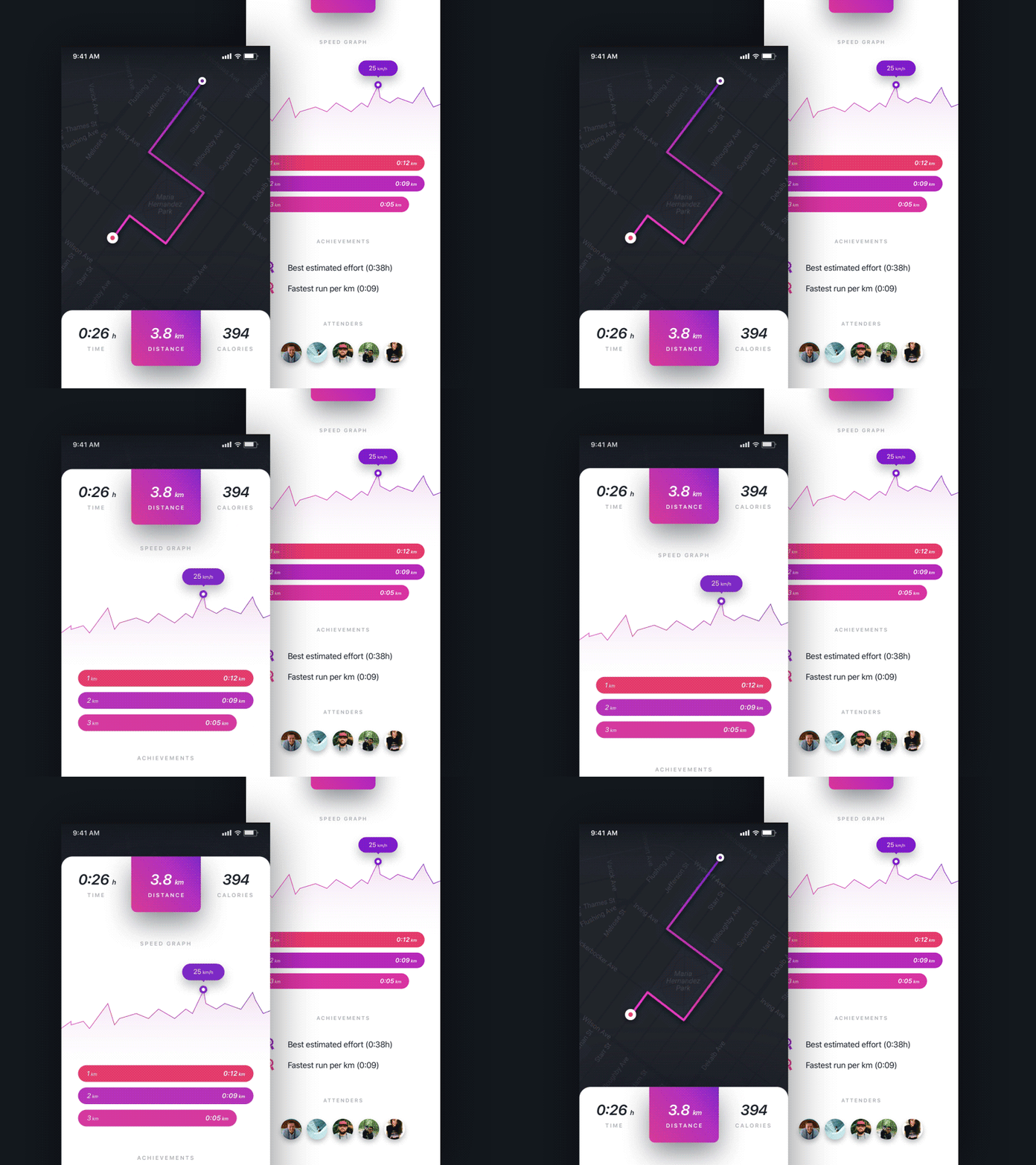
For the design of the app I browsed dribbble.com to find different inspirations from a wide range of app designs, screens, and animations. I drew inspiration for individual aspects, colors, and layouts from the screens represented in the mood board. Overall I looked for minimalist designs with clear and simple to understand UI.

BoroughtBike App Flow

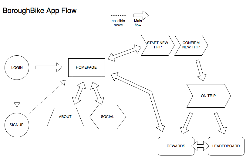
I mapped out a simplistic flow for the BoroughBike app. The flow represents how the user can move through the app both from the menu, and from screen to screen.

BoroughtBike Map Page inspiration

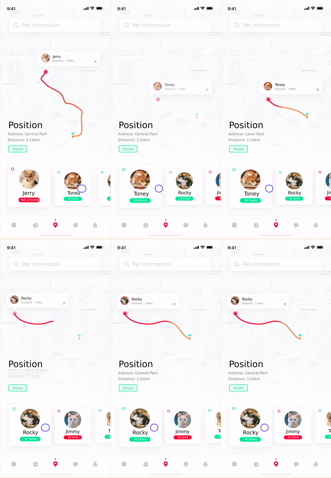
There were two map animations that caught my eye and seemed to capture what a potential map screen could look like in the app.

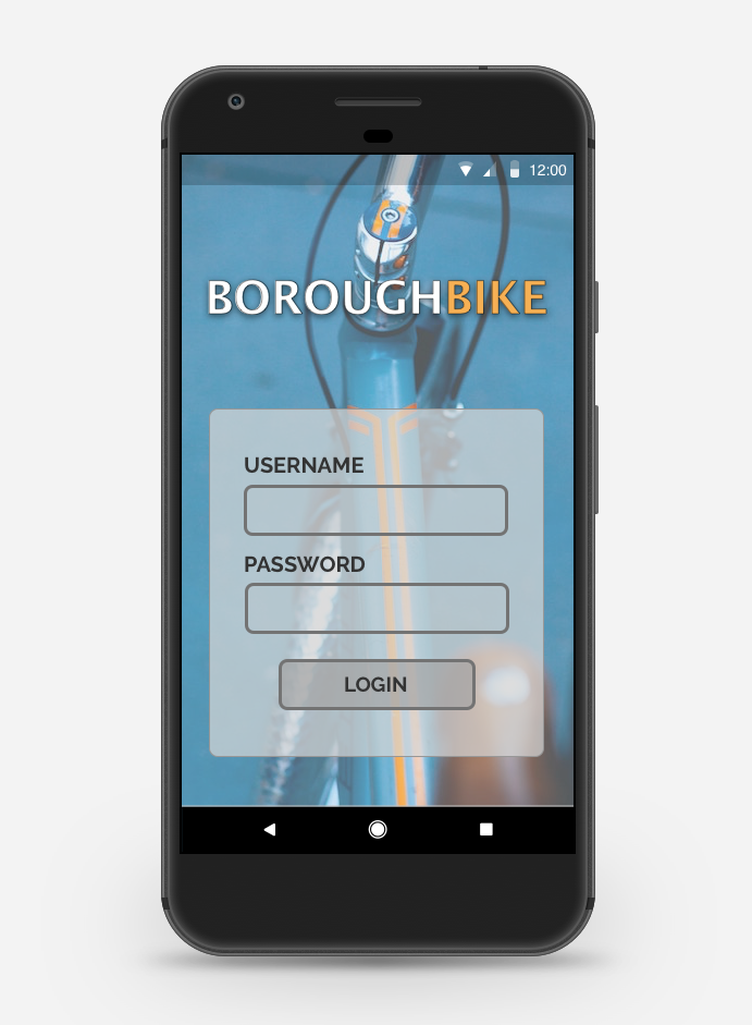
BoroughtBike Sample App Screens

From the above inspirations I designed a simple login screen and another screen that represents a new trip. These two screens represent a sample of what final app screens would look like